Great masculine logos
I must admit that it was easier to make the selection of feminine logos than it was to find logos with truly masculine characteristics. Manhood has changed its core, it has become more sophisticated and diverse and in some cases more effeminate. Take for example the metrosexuals, a softer version of men living in a capitalist culture with a strong concern for their appearance. The wild spirit of the true man seem to have faded away, or at least dissipated and become a rara avis. The men have changed since the day they were branding the cows with the fiery iron and so were the type of branding that is addressed to them.
Even if we get our food at the superstores and not from the wild there are still elements that define a man. Harsh lines, bold colors, a spirit thirsty for adventure even if it gets it via video games or movies. When designers are trying to convey manhood they stay away from soft or complicated concepts and adopt clear, aggressive lines, strong images and inflated imagination. As women need the logos addressed to them to tell a story, men need an invitation to adventure. As opposed to intricate and mysterious, man react to simple and straight forward.
The selected masculine logos are proactive, dynamic and bold. They transpire action and passion, elements that construct the very essence of manhood.
Bike me Logo by tanyafoss16
Outlaws Logo by Odney
Cazadores Logo by Alan Oronoz Madriles
Wild Soul Logo by Chariot
Bull New Media Logo by SencerBugrahan
Mocha Man Logo by Craig Russell
Nobilis Logo by Daria
SRM Logo by Pure Fusion Media
Artisan Builders Logo by Van Paul
Watcher Logo by Ivan
RAMM Logo by designabot
MadDog Productions Logo by UtahRugbyGuy
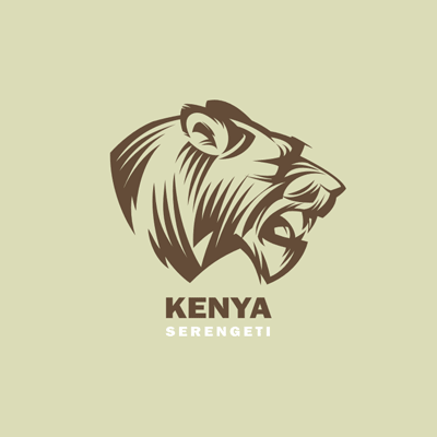
Kenya Serengeti Logo by Gal
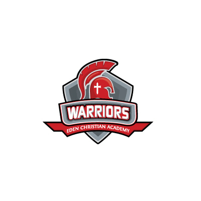
Warriors Logo by Paul Jobson
Adventure Logo by vasvari