Logo of the month: May 2012
We're back with our usual monthly Top Ten featuring some of the best logo designs posted in our gallery last month. We were preparing for a close race for the Logo of the month when atomicvibe posted some of his work a threw our top up side down. It was kind of a "vini, vidi, vici" type thing. He came by at the end of the month and swipe us off our feet with an amazing design work. So, yeah, maybe I spoiled the surprise this time unveiling the winner from the very beginning, but this kind of work simply deserved the praise. I'm really not trying to diminish in any way the rest of the beautiful logos that make out top this month. They're totally worthy of your words of love an appreciation. So don't withhold them… post your comments and let the winners know they are amazing logo designers.
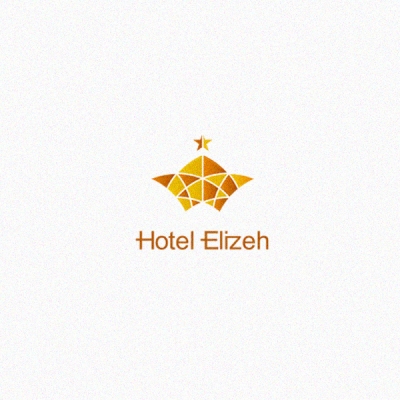
10. Hotel Elizeh Logo by 1ta
Architecture, tradition, high-end market they're all concepts so well transposed into this logo design. Classic architectural shapes are given dynamism by using curves instead of straight lines, local character and tradition are imprinted by juxtaposition and trimming of superimposed shapes and high-end market is subtly suggested by using golden shades and star shapes. Sans serif, modern typeface is associated with the symbol, but it is given character by small, tasteful alterations.
9. Centar Logo by communication-agency
"Simplicity is the ultimate sophistication" said the great Leonardo. We'll all have to agree that simple solutions are always the best. And how to best represent an intricate search algorithm based company than by a dot-line-dot connection converging towards a center. The design concept is great and the simple representation of it in this case amazes me.
![]()
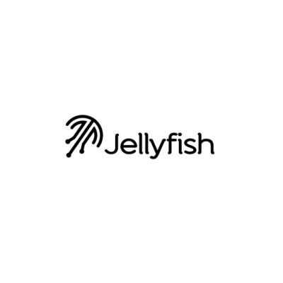
8. Jellyfish Logo by Type and Signs
An electric monochromatic mark that is consistent from one end to the other. The whole mark, symbol and text seems to be made from pieces of circuit wires and beyond its simplicity, that is enough to make this a memorable logo design. Great play with it, TaS!
7. Indian Tea Logo by communication-agency
A beautifully played logo design combining a teapot and an indian traditional elephant element. Great work of smoothly integrating the two elements without being too obvious or trying too much. I love the toned down shades of green and the light touch of yellow. Even if I would have chosen another typeface for it, the brush script seems to work fair enough for this logo.
![]()
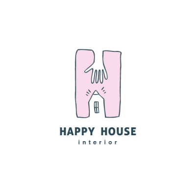
6. Happy House Logo by Glad Head
This playful, childish style icon makes a great logo especially in contrast to the serious, simple word mark. It is a very surprising combination that seems to work so well for this type of business. From sketch to finished project, with a touch of character seems to be the idea behind this carefully crafted logo design. I can appreciate the simple hand drawn logo designs, with a childish like style as they more often involve a lot more work and attention to details that it may seem at a quick glance.
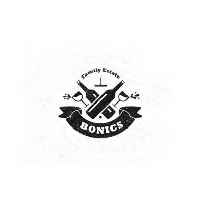
5. Bonics Family Estate Logo by 1ta
Vintage style logo design never seem to grow out of fashion. Instead they acquire heritage and build trust. Bonics is a great achievement of vintage style, monochromatic logo that is bold and memorable. I love its playfulness and dynamics and I appreciate the personal slant applied by the designer with the soft edged ribbon that adds to the character of the logo design. The coat of arms style builds on the idea of heritage, but the designer keeps a certain friendliness to the logo reminding us that this is a family business.
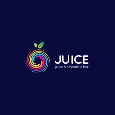
4. Juice Logo by almosh82
Simple ideas are often the best, and they usually help build the strongest brands. Juice is a sample of beautifully implemented idea, with a memorable symbol - by shape and color - in conjunction with a nice, versatile word mark. A great logo design ready to be placed on a product as an impact brand.
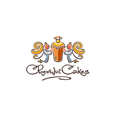
3. Cherubi Cakes Logo by Type and Signs
What are the odds of having cake logo design battling for the logo of the month… but here we are. Once again we're happy to be enchanted by the amazing TaS design style, amazing eye candy color scheme and perfectly crafted typography. In not so many words, an outstanding piece of mastery logo design.
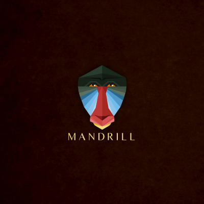
2. Mandrill Logo by Melanie D
This logo has such a great feel to it that it manages to transport you into the natural habitat of the character. You can feel the wild spirit of an animal that dwells freely into the depths of the rain forest just by looking at this logo design. Amazing set of color are used as if depicted out of a photograph and they build atmosphere and environment without actually having one. Great, simple, sunny colored typeface works perfectly well with the hard edged design of the logo. Outstanding work!
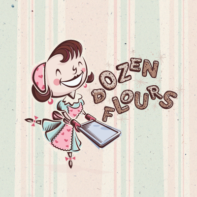
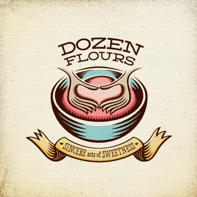
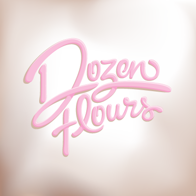
1. The Logo of the Month, May 2012: Dozen Flours Logo by atomicvibe
And the winner is atomicvibe with his Dozen Flours logo design project. The whole process was amazing - so kind of you, Jon, to make it available for us to see it and get inspired - and it's full of creative tips and great design approaches. The entire outcome - all three logo variations - are simply amazing and I included them here as winners as they are all part of the same creative thinking. We might be in for a record here as this is the second in a row Logo of the month title that Jon swoops. Congrats, Jon, for these outstanding logo designs! It is well deserved!