
Mulino Bianco Logo History
Anyone who's been to Italy should have tasted at least one of the Mulino Bianco products. Mulino Bianco is an iconic Italian brand and known well beyond the borders of its origin country. It started as a family business, like all great Italian brands and became a global success through developing excellent products and great marketing. We've put together a series of logo design and package images from the history of Mulino Bianco company, elements that we thing are of great inspiration for any designer.
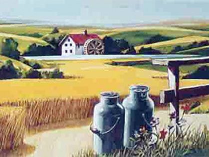
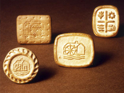
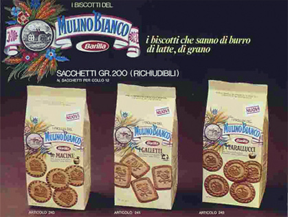
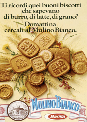
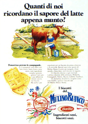
Mid 1970's mark the beginning in production of the first Mulino Bianco biscuits, after several years of experimentations. Branding images were developed to mark and help sell the products. The idea was to tell the story of returning to the simple things of the country side, a going back to the natural and original ingredients, the smell and atmosphere of grandma's kitchen, an attempt to resuscitate a world that is true and kind. Thus, images representing the beautiful and serene Italian country side were selected, images representing sunny fields of grains, an ancient mill (that will become the main icon in the logo design), trees and a peaceful creek. To go even further the biscuits were imprinted with these symbols to strengthen the mark.
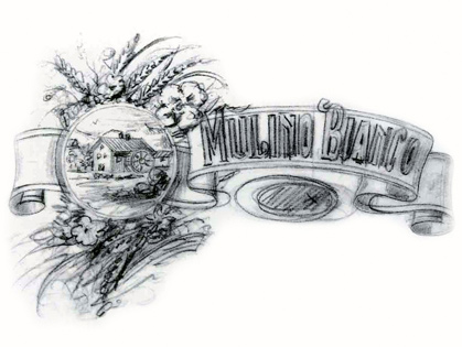
The first drafts of the Mulino Bianco logo were done in the genuine English style of Biscuit House Mary Ann. But the drafts were dropped to develop a logo that had more character, a logo the would represent tradition and had an authentic country side mill.
![]()
![]()
![]()
![]()
![]()
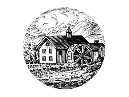
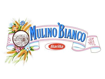
The Mulino Bianco mark developed by Gio Rossi in 1975 and inspired from an old stamp, was the result in combining three main elements: the ears of wheat and the flower bundles representing the nature, the silhouette of the small country side mill representing the heritage and tradition, and the wordmark Mulino Bianco that stands for the natural values, the tradition and the genuineness of the company.
The impact and the development of the brand were achieved through creating a homy and "dolce vita" atmosphere through excellent advertising and marketing, where the Mulino Bianco logo design was alway a centerpiece.
Over the years, Mulino Bianco logo suffered little changes. A few years ago McCann-Erickson did an update on the logo to bring it to the 21st century, but they kept its character and heritage intact.
![]()
For more information on Mulino Bianco logo, packaging and marketing materials visit http://www.mulinobianco.it