logo redesign

I think there are a few things in our lives which we believe that are perfect just the way they are. Like my mom’s noodle soup. I have never eaten a more perfect noodle soup than my mom’s. I have tried many noodle soups in my life, even the ones made by myself. Not even one came close to the perfection of my mom’s.

If you're a fan of Cleveland Browns, you may have already heard that they have a new logo. The logo design update was unveiled on Tuesday and the Browns will use it during the 2015 season.

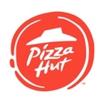
The large american pizza chain recently unveiled a new logo. It’s flat, round and of course, red.

As we’ve seen with a lot of new logo redesigns, companies tend to follow the trend of simplifying their logos. They mostly do that to stay current - Apple and Google, both push a very clean and relatively flat design for their devices, and believe it or not, the tech world influences a lot the rest of the world.

What has been an existential question for Hamlet many centuries ago, may just as well become as live and death a question for any company or business. When it comes to who they are and how they are perceived by the world around them, redesigning should be a option, always at hand.

Your company's logo speaks to your potential and existing customers when you aren't there to do the talking yourself. First impressions last, so it's important that your logo is instantly recognizable, and your message is conveyed clearly.