
C. I. Hood Identity
Profile: Nick Hood
Website: Nick Hood
Here is one of the concepts for my dads business.
Since 1979 C. I. Hood, Inc. has been providing graphic design, illustration, and advertising design to its customers in the Pacific Northwest, West Coast and Around the World.
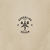
This crest combines art tools, a crow, anchor and sea waves. The crow is a heraldic element from our family crest. The anchor and sea waves represent the large amount of maritime work they do.
The beautiful photo is by Anna Morosini.
http://www.flickr.com/photos/a_morosini/
Related logo designs

|

|

|
|
|

|