Logo of the month: September 2011
We had a good run again in September here at The Logo Mix, with loads of cool submissions and a tough time deciding the top ten. It was a close race and I feel that any of the logos in the top five could have made it to the logo of the month. But somehow we had to decide on a ranking. Enjoy the selection and leave a praise for the winners.
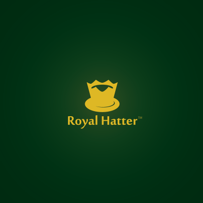
10. Royal Hatter Logo by alex4za
A creative idea, simple lines that build a strong mark, and a nice choice of beautiful typography that compliment a logo design that sits together very well, has balance and captures your eye. The color scheme is well chosen to bring forward the golden color of the logo, but I think it would look just as well in black on a white canvas.
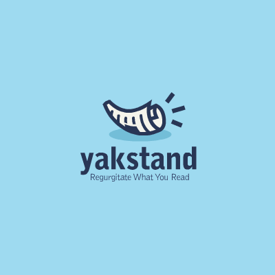
9.Yakstand Logo by brandsanity
We just loved this icon style, bold mark achieved by using simple lines and just enough details to make a stand. The idea is nicely illustrated, using nice, contrasting shades of blue. The lines are firm without being stark and the font used is modern and bold, adding to the statement of the logo design.
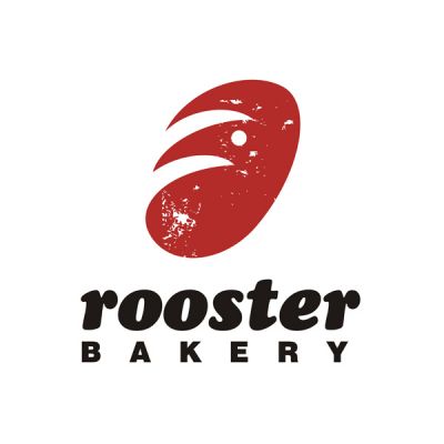
8. Rooster Bakery Logo by SHTEF SOKOLOVICH
Rooster bakery symbol is a very nice visual achievement combining beautifully graphical elements representing the two concepts in the logo: a cockscomb to represent the rooster and a loaf of bread for the bakery. It is an ingenious and unexpected word combination, but the graphical outcome looks quite good, especially with its vintage feel. I'm not mad about the font choice, but as long as it functions well and the overall outcome is good, we can call it a great job.
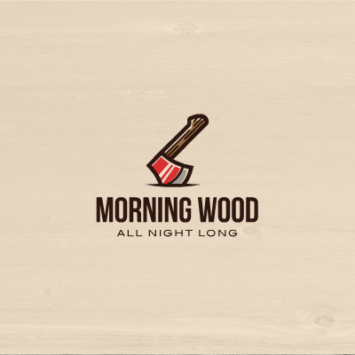
7. Morning Wood Logo by brandsanity
We must appreciate the beautiful illustration here, the axe was carefully crafted, great attention was payed to every detail without overpowering the symbol. The use of lighting is very nice and the bold strokes just give power to the mark. The tall and bold typeface in combination with a wider one emphasize very well the idea of the logo. We must appreciate the smart and clean interpretation of a rather intimate subject. Nicely done!
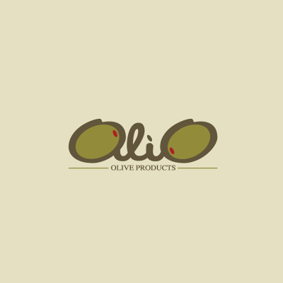
6. Olio Logo by alex4za
Cool fusion between text and symbols in the Olio logo design. The logotype has a very nice wavy flow to it, very appropriate for the industry, and the way the two olives are integrated into the flowing course of the text is just great. The red accents are a good call and they compliment very well the design, just enough to help the viewer make sense of it all. Nice, simple, uncomplicated explanatory line sustains and acts as a base for the design. If it was my call I would probably gave it more space, but it seems to work fine anyhow.
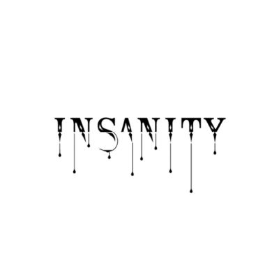
5. Insanity Logo by Type and Signs
Painfully and insanely beautiful custom typeface in the great style of L&B, manages to amaze us once again. This great tattoo style logotype is so well design that you can almost feel it stinging you. I just love the proportions and the atmosphere it creates. Great job, again L&B!
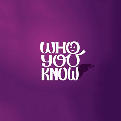
4. Who You Know Logo by Simon Says
Type and symbol are a perfect match in the "Who You Know" logo design. They are welded together so well that you need to make efforts to distinguish the two. The pen line is beautiful and the logo seems to have been drawn from one single take. It has that childish feel to it blended in with a careful attention to details, proportions and structure. Great call with the shading that emphasize the stand up structure of the design.
3. Ocean Logo by stanovov
"We all live in the yellow submarine…" well actually, as this logo suggests, the ocean lives in the pictures taken by this yellow submarine photo camera. An ingenious idea with an outstanding execution. The submarine camera is beautifully crafted, with a very nice choice of color scheme, great little cartoony details and excellent shading. When it comes to the custom typeface, we have only words of praise and appreciation for a work greatly done. Beautiful integration with the symbol and perfect lighting effects.
![]()
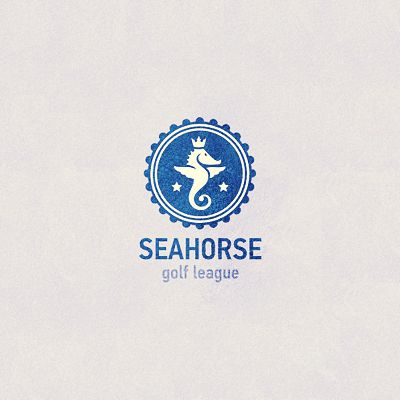
2. Sea Horse Logo by stanovov
Seahorse logo is a true work of elegance. A very nicely crafted seahorse icon is integrated into a badge type of design, with hints of a ship helm. The crown and the two stars announce the high end positioning of the organization, and the bleu marine color scheme is more than appropriate. Elegant and modern typeface is the perfect choice for a striking and memorable logo design.
1. Logo of the month, September 2011: Polar Bear Logo by Anghelaht
What made us call the "Polar Bear" the logo of the month? Well, besides the obvious, we thought it was the one that managed to create and transmit best the atmosphere and the feel of the design. The bear icon almost resembles an igloo, a symbol of shelter and survival in the cruel cold of the polar environment. The logo lines are subtle, with mild curves and the color scheme is composed of soft hues of pale blue that kind of make you feel the cold. The chosen typeface works well with the icon, almost picking on the curves of the symbol itself. All in all, a great logo design achievement. Congrats, Anghelaht, for a job well done!