
A (brief) logo design history
In the ancient Greek culture, the word logo literally meant "word" or "speech". Other cultures - the Babylonian, Egyptian Assyrian, Chinese or Mayan used pictographs to communicate words and ideas.
Today, as you all know, the word logo represents a creative merge between words and icons, indicating the two most important constituents of a corporate identity.
First is the company's name - the key factor in creating a company's presence.
Then the most crucial aspect in the identity development process is the company's visual identification symbol - a literal signature (logotype), a graphic symbol or a composition comprised of a visual element and the company name usually used for greater impact.
Actually the use of the symbol-only is generally an ultimate choice, because it can be more difficult to associate it successfully to a company's identity, requiring extensive time and money to promote.
The cost effective choice is the combination of the visual identification symbol with the name of the company, because they can increase the emotional impact appealing more effectively to a wider audience.
If we are to talk about a history of logo design we have to go far back in history to discover the first cases of logo design use.
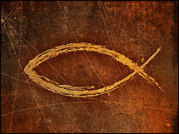 I think one of the oldest logo designs that is used even today can be found in the first century, in the dawn of Christianity, when a symbol of a fish was used as an identification mark among the first Christians.
That particular logo is still used today as a logo by the Christian communities for similar purposes, with minor design alterations.
During the ancient times, the rulers of towns would emboss their name or face on wide circulation materials (as the coins) a case of logo use for "personal promotion".
In the thirteenth century, we can agree that Goldsmith's marks, masons' marks, paper maker's watermarks and watermarks for the nobility can be considered cases of logo design use.
 Another example of a logo design that is used today can be found in the 19Th century England. Marcus Samuel started selling shell-covered boxes to children and tourists, in London. As his business prospered he diversified his merchandise to jewels, kerosene and even oil. By 1830 his company became known world-wide being consolidated in 1897 as the Shell Transport and Trading Company. Due to the company's first specific activities, a simple drawing of a seashell was adopted as its trademark becoming ever since the world known SHELL logo design.
![]() Of a more recent date is the logo design of the ADIDAS Company a name that stands for professionalism and high quality in all sectors of sport around the globe.
Of a more recent date is the logo design of the ADIDAS Company a name that stands for professionalism and high quality in all sectors of sport around the globe.
The company was founded by Adolf (Adi) Dassler, who started making shoes in the 1920s with the help of his brother Rudolf Dassler who later started the rival shoe company Puma.
For many years, the only symbol associated with Adidas was the trefoil (flower) logo design. The leaves stand for the Olympic spirit, with links to the three continental plates.
In 1972, the trefoil was set as the official corporate logo design.
In January 1996 though, "the trefoil'' has evolved to "the three stripe" as a symbol of the futuristic performance and the company decided that the trefoil corporate identity would only be used on heritage products.
Who is the oldest car manufacturer? Its logo represents a three pointed star, designed by Gottlieb Daimler's sons to sugest his motor's domination on land, air and sea.
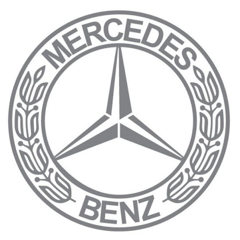 Yes is Mercedes-Benz; its logo symbolizes one of the most famous brands in the world. It was first seen on a Daimler in 1909 (when officially registered) and was combined with the Benz laurel wreath in 1926 to suggest the merge of the two companies.
Its logo has suffered insignificant changes over the years.
A logo that strongly reflects the tradition and the history behind it is the the NASA logo.
With its pioneer research in aeronautics and exploration system, NASA is now one of the most influential agencies in the world.
 The first NASA logo can be traced back to 1959, which featured the Sun, the moon, the white stars, the orbital path and the red chevron with "National Aeronautics and Space Administration" encircling the image.
However, due to the complicated design, the logo was simplified, being reduced to the stars and the orbital path on a blue background with the red chevron passing through the letters N-A-S-A.
In 1975, the rumors of NASA's developing a new and a more modern NASA logo were out.
Thus, NASA logo was named the "meatball" to be distinguished from the other two NASA logos.
Introduced in 1975, the modern NASA logo was reduced to a stylish rendering of the letters N-A-S-A in red color. Because of the fluency of the letters, it was called the "worm" logo.
![]() From 1992 till now, NASA has used the "meatball" as their logo.
From 1992 till now, NASA has used the "meatball" as their logo.
Greg Patt, Graphics Manager for Lewis' Publishing Services considered it a "design nightmare" because in the laser print the logo does not appear clear.
The explosion of the information age has changed the concept of logos and logo design.
Today, people have become more and more aware of the visual symbols, especially those used as trademarks.
It is vital that a company logo looks professional, because company logos are the face of the business to the public, but also to its employees and the company itself.
If a company wants to step out from the crowd, it is imperative to use the front line of a corporate identity, THE LOGO.