
The "DO NOT" in a business logo design
Logo design is the graphical representation of a business, a tool that gives the first impression of a business.
A unique, recognizable identity or 'corporate logo' has become an essential part of business strategy and success so it's vital that proper consideration be given to this aspect.
Logo design is the graphical representation of a business, a tool that gives the first impression of a business.
A unique, recognizable identity or 'corporate logo' has become an essential part of business strategy and success so it's vital that proper consideration be given to this aspect.
Before starting a business one should pay attention to the logo design. The logo should reflect the company's name and its nature of business.
An amateur like or inadequate logo design can be fatal to a company's image. On the other hand, an eye catching logo design can create an impression of professionalism and experience.
Many small-business owners, however, don't pay enough attention to their company's logo design. Many others just don't understand its importance.
- - A logo design should be eye catching and simple.
- - A simple color pattern and a short text are the best choice.
- - It should not appear cheap, heavy decorated or rainbow like colored.
- - The most common mistakes in a business logo design regard the following:
Never use a clip art in a logo design!
Firstly, on many clip art CDs or software, in the "terms of use" section you'll find that it is forbidden to use clip art in logo designs. Further more, since one can't get sole copyright for it, more similar business logos can appear! And from here to a lawsuit is a small step!
Also, using clip art can also seriously damage business or/and designer credibility and lose vital sales for both.
The conclusion: avoid clip art like a plague!
The whole range of rainbow palette does not get you there!
The most effective logos - especially in terms of cost - are those with up to three colors or less.
Drop-shadows, glowing edges and bright-crazy colors seem to add drama to a logo, but they can also distract from your design.
A business logo should talk professionalism, soberness, simplicity and clearness.
Bright and playful colors are for the entertainment industry!
Also, when you need to print the logo, you will need a high-end expensive printer to produce a high quality work.
Light colors, shadows and/or gradients in logos do not fax or copy well and are difficult to read!
On t-shirts - for example - logo designs with these attributes can also be difficult and/or very costly to print.
Crazy or comic sans should be forbidden in a logo design by law!
As for the font of a logo design, many people choose for their new business logo a nice simple font or maybe even a classical one that represents accurate the nature of business.
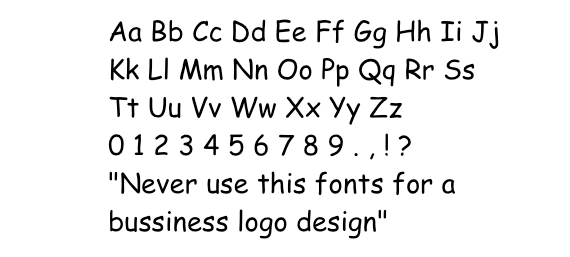
Unfortunately too many are choosing the dreadful Comic Sans MS.
A reasonable font... for children website or picture book.
This typeface and many others similar to it shouldn't be used for corporate logos.
Seen in a business logo, the Comic Sans appears as a vulgar scratch on your eyeball that makes you wonder how a designer can get away with it.