
Famous Logo Design History: Audi
The history of the company goes back to 1909 when August Horch founded the company and named it Audi, a Latin translation of his own name. "Audi" was actually the Latin word for "hear", which in German is sometimes pronounced "hoerch". At the time Horch founded the company, the logo had little in common with today's logo or the famous "four rings". It consisted of the writing of Audi in a V-shape and the number 1 on top.
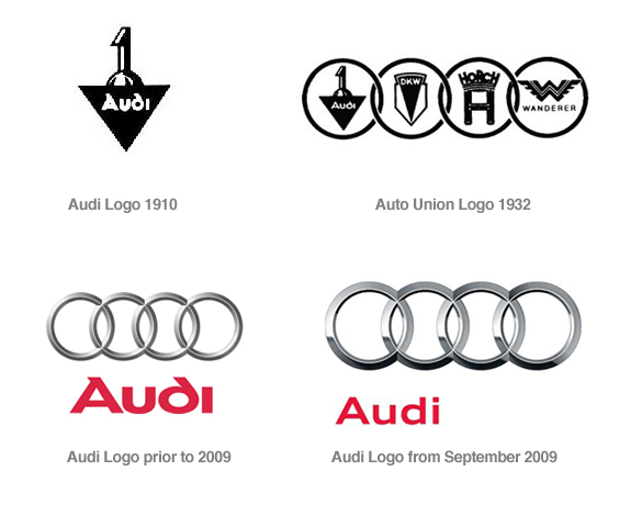
The famous "four rings" logo was brought on the scene of history later in 1932 to represent the merger of the four independent motor-vehicle manufacturers, Audi, DKW, Horch and Wanderer. The new Audi logo was designed as the emblem of "Auto Union AG" and in the first version, every ring contained the logo of the four merged companies. It is believed that the use of the four rings logo is most likely to generate back to the idea of Olympia and the Olympiad.
The current logo was released in 2009 and show an improved version of the three dimensional aspect of the rings and a new and modern typeface for the Audi text. It was a welcomed and well-received facelift from the previous version of the logo. Due to the increased recognition of the brand, Audi minimized the use of the actual text in the logo to push forward the "four rings" emblem, allowing the symbol to appear in some cases even without the Audi text, with an emphasis on the heritage and an increased flexibility. That is what a great brand can do.