Famous Logo Design History: McDonald's
It's probably partly because I'm hungry right now and partly because i believe that McDonald's has nail it with lots of things but especially with the french fries. McDonald's has one of the best recognized logos worldwide that sometimes becomes synonymous with fast food. When you are a player into the global market, a powerful visual identity that gets you out of the crowd and positions you as a leader is of crucial importance.

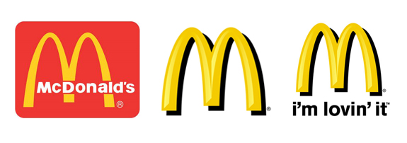
McDonald's logo was designed in 1962 by Jim Schindler and has become a star of multinational expansion. The symbol consists of two golden arches designed to resemble the arched shaped symbols that used to be on the side of the restaurant. The two arches joined together formed the golden colored letter "M" that reflects the name of the fast food chain. The McDonald's name was added to the joined arches symbol later in 1968.
The McDonald's logo corporate colors are golden and red and they vividly express boldness and power. The golden arches proudly stand for elegance, significance and solid corporate character.
Today, the world wide known symbol is accompanied by the company's slogan "i'm loving it" and that seems to be enough for everyone to know what's it about. The McDonald's logo confirms the quality and the uniqueness of the product and has become one of the world's most recognized brands.
