Great Vintage Style Logo Designs
You'll have to agree with me that vintage style is in trend these days. Not many logos are done in a pure retro design style, but more logos seem to adopt elements or characteristics of the vintage trend. I've made a selection of the best logo designs that use vintage elements, posted here at the LogoMix gallery and I tried to identify what are the main characteristics used to achieve or to imprint a vintage feel to a logo design. Here is what I've observed. Feel free to approve or disapprove with my list of elements, or to add your own.
1. clearly defined and mostly simple lines that build a fairly complex design
2. hand drawing and cartoony style
3. swirly banners
4. limited in number and washed out colors, mostly browns, sepia and sandy colors, but also washed out and desaturated blues and reds
5. solid colors vs. scarce use of gradients - replaced by handmade and solid shading and lighting
6. worn out or distressed colors or textures
7. simple color combination, that usually includes brown or sandy colors
8. use of paper, fabric or other textures
9. containers, usually but not limited to circular or square
10. tall, serif, slab serif or hand typeface with precise and thick shadow
Hand Made Logo by 13mu

Seven Hedgehogs Logo by Artem Dvorzhak

Mixed Threads Logo by Dan Gretta

Pin-up Girl Expresso Logo by UtahRugbyGuy

McKay's Bakery Logo by BartODell

Leap Travel Logo by jerron

Count Dracula Logo by Andrei Gadoiu

Jazz Brand Logo by Yoon

Triple Vision Logo by 13mu

Cream and Sugar Coffee Logo by BartODell

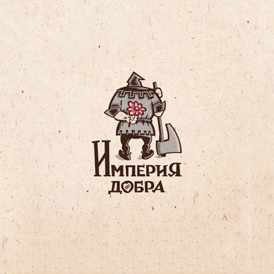
The Empire of Good Logo by Simon Says

Private Grave Logo by Dan Gretta

Reel Farm Logo by michaelspitz

Daily Booth Logo by Dache

Helmethimb Logo by 13mu

Russian Collection Logo by Alexey

Black Coffee Logo by Dan Gretta

Picshooter Logo by Lorena e Bernardo

