
Logo Design and Color Philosophy
How important is color in a logo design? Does western culture has a different color perception than the Asian One? Has a world class logo design the same impact on the western market as on the Asian one?
Where to apply the effectiveness of color than in the marketplace where it is a vital key in communicating a product's or a company's positive and irresistible image? The "silent salesperson" as often called, a color must immediately attract the consumer's eye, summarize the traits of a the product, create a brand identity and, ultimately but most important, help to make the sale. At the very least it must create enough interest or curiosity to induce the would-be buyer to find out more about the product (or service).
Often the human reaction to color is subliminal and consumers are usually unaware of the persuasive power of color. But the psychological effect is instantaneous as color stimulates the senses, exerting its power of suggestion.
The power of the color is seen at every level of communication: in logo designs, signage, advertising on television, billboards, in print media and packaging.
In the western culture, red is associated with danger, love, heat, passion, energy, fire, excitement, speed, arrogance, ambition etc.
Blue is the most conservative color, perceived as serious and conscientious, suggesting dignity, reliability, trust, peace, unity, harmony, tranquility, calmness, coolness, confidence, conservatism, loyalty, dependability, cleanliness, technology but also depression and coldness.
Now let's talk Asia.
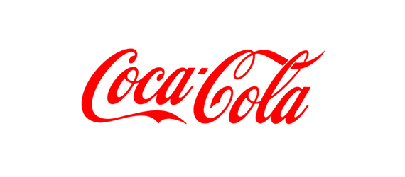
The Asians as the rest of the world associate red with the Coca-Cola logo design. In this, the world is one.
In China, red speaks about power, prestige, and happiness. Red is the color of the Chinese New Year, weddings, luck and happiness.
Koreans are unique in the world in their association of red with innovation and the colors of the LG company logo design.
Thus, while in China red evokes traditional images, Korea connects red to the future and technology.
As for the blue, the Chinese think power and reliability. Technology comes to mind when they think blue. IBM logo design is still blue in China.
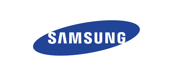
The Koreans associate blue with freshness and innovation and also with technology (the Samsung logo).
In Japan, unlike in China, blue is not a color associated with power or reliability, inspiring them sadness (as in the western culture).