Logo of the month: August 2012
We're back with a "hot from the oven" new release of The logo of the Month, here at The Logo Mix gallery, after a long summer break. I've got to confess, I thought this was an easy one… few good logo designs over the summer, put them together and bam, the logo of the month is ready. This couldn't have been more far from the truth. It seems that a lot of logo designers are keeping busy over the summer, and that they are quite inspired too. We've had an amazing list of logo designs to choose from and we've had to put in quite a bit of work to select the best ones.
We've also come up with a new way of presenting the things that impressed us about a logo design: Thumb up, for the things that we think are greatly achieved, and Thumb down, for the things that we thought needed some improvement (if it's the case). Hope you'll enjoy it.
We've got a special designer mention this month that goes to milena, who, even though she didn't score the logo of the month, had 3 amazing logos in the top ten, and a few other in her portfolio that worth your time.
Check out a cool selection with the best logo designs posted on The Logo Mix Gallery in the month of August 2012, and leave a nice comment for the amazing designers that shared their work with us!
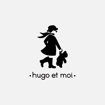
10. Hugo et moi Logo by milena
Thumb up
+ Amazing illustration that really tells a story
+ Even without the French text, the illustration has the intended feel (check the scarf, the funky hat, the large glasses, the attitude of the character)
+ High elegance for a monochrome design
+ Great use of the negative spaces (for face, hand and legs)
+ Amazing typography fit
Thumb down
None
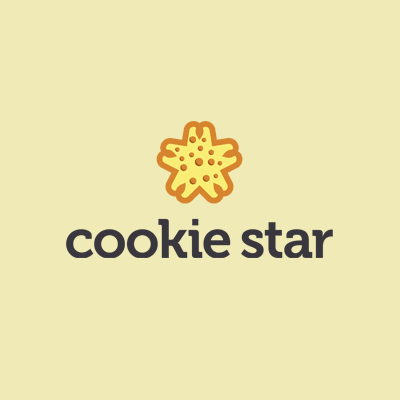
09. Cookie star Logo by ghost_d
Thumb up
+ Excellently illustrated combo concept
+ We love the colors, and how they really make the logo appealing
+ Great way the designer linked the style of the chosen font with the style of the symbol
+ Good choice of bold, high impact typeface
Thumb down
I think a bit of color for the logo type would have given it a bit more finess
08. Personal Logo by marekmundok
Thumb up
+ Very well illustrated sky-high creativity concept
+ We love the badge style of the logo, the balance and proportions of the elements and the high contrast
+ We appreciate the fact that the logo is self explanatory, it doesn't seem top be needing any additional text
+ Great addition with a bit of light and shading
Thumb down
None
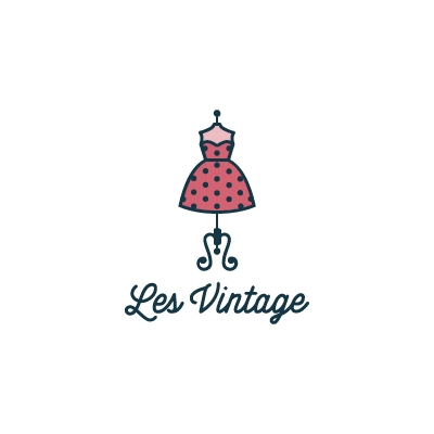
07. Les Vintage Logo by milena
Thumb up
+ Amazing style of the illustration to really give us a vintage feel
+ Well chosen muted colors
+ Good choice of elements, excellently designed elements
+ Great typography choice to go along and complement the feel of the design
Thumb down
None
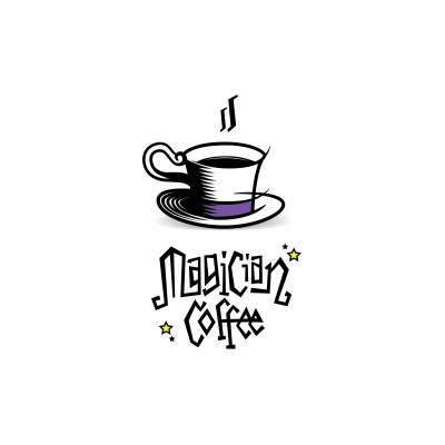
06. Magicial Coffee Logo by chrisworks
Thumb up
+ The design style reminds me of Samantha and her magic maker nose. That movie had a similar style for the opening animation
+ Well played magician hat / coffee cup metaphor
+ Exceptional, custom designed typeface works very well with the design and complements the illustration
+ Very nice addition of the star elements to give us a taste of magic happening right under our nose
Thumb down
Maybe its just me, but I felt the need of a little bit more color. Seems just a tiny bit austere.
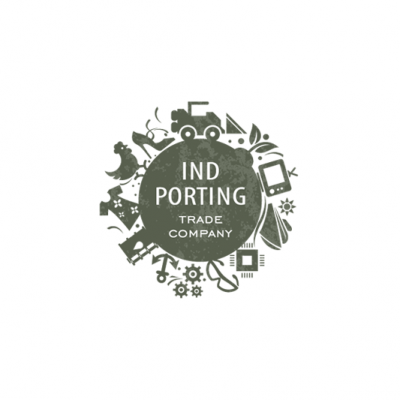
05. IndPorting Logo by Type and Signs
Thumb up
+ Great way to create an impact logo by gathering well designed little elements
+ Love the way a consistent style is kept for all the little bits
+ Simple, modern typeface is used for the text, an excellent choice that will not add noise to the conglomerate of elements
+ Great, subtle texture is added to get an extra something to the logo design
Thumb down
None
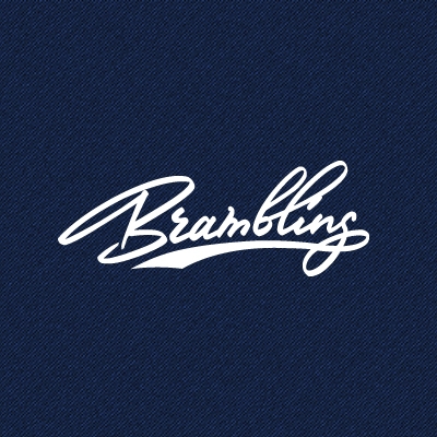
04. Bramblings Logo by Vitaly
Thumb up
+ love the character of the typography
+ Dynamic and carefully designed letters
+ Nicely designed little details that make the logo memorable and imprint it a certain style
+ We really appreciate the way the designer managed to create an iconic logo using well designed typography
Thumb down
None
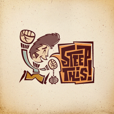
03. ST! Logo by atomicvibe
Thumb up
+ High-end illustration skills used to create and excellent logo design
+ Powerful image that clearly speaks and tells the intended story
+ We loved the color scheme and the amazing design style
+ Well designed set of elements that sustain and enhance the message
Thumb down
None
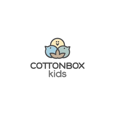
02. Cottonbox Kids Logo by milena
Thumb up
+ Great interpretation and design solution starting the cotton balls. We really loved how they turned into small, playful little birds
+ Excellent association between illustration style and the font of choice
+ Soft, muted colors, very natural and very much appropriate
+ Beyond its fines and softness, this is a high impact logo, memorable and extremely versatile
Thumb down
None
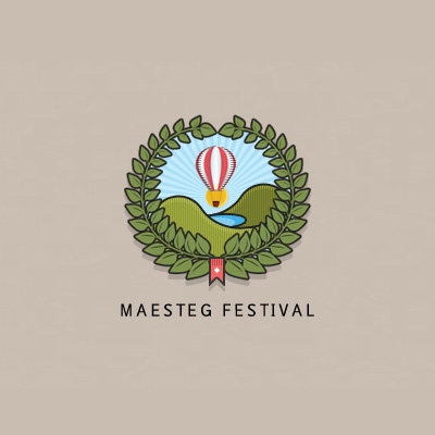
01. Logo of the month, August 2012: Maesteg Festival Logo by carlos08
Thumb up
+ Amazing illustration with great style and just the right amount of details to make this a versatile logo design
+ Excellent colors and and great way of transposing character of the depicted location
+ True eye candy logo design
+ Love the tall, minimalist typeface choice
Thumb down
This is the logo of the month, so don't expect any thumbs down here.
Congrats, Carlos08, for an excellent logo design and keep sharing your work with us to get everyone inspired!