Logo of the month: July 2012
It's summer and it's hot! We're here to cool off your creative thirst with some amazing logo designs. You guessed it! It's time for the Logo of the month winners to show off their best designs posted on The Logo Mix in July 2012. Most people are away on a sunny beach during the summer and logo designers are no exception. There are still a handful of designers left to battle on the barricades and keep the creative juices flowing even in the hot season. As usual, we present you with the top ten logo designs posted on the Logo Mix gallery last month to get you inspired, bring joy to your eyes and get the ideas rolling in your head. Enjoy and don't forget to drop a word of praise for the oh, so worthy, designers.
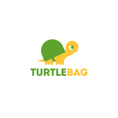
10. TurtleBag Logo by ru_ferret
A simple but extremely cute and fun little character, that impressed us by the clarity of lines and the well designed details. The steady hand and the experience of the designer is clearly seen with this logo… no complicated stuff, no useless decorations. You can almost see this little turtle animated. Simple typeface was chosen to go along the line of the character design and is a perfect match.
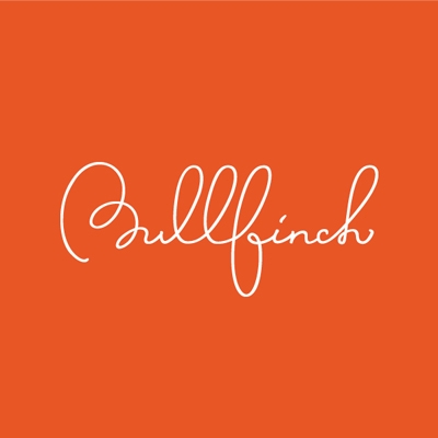
9. Bullfinch Logo by Vitaly
I must say, I'm so glad to have again a really nice type work on our monthly selection. Excellent flow and really beautiful ligature make this a bookmark logo design. The curves are beautifully executed with soft arches and perfect balance. Great detail work makes you stare and invites you to discover precise inflection points and and well designed curves.
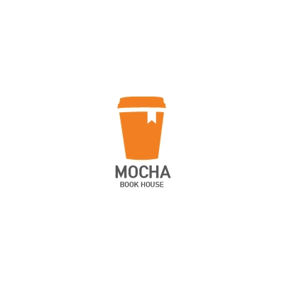
8. Mocha Book House Logo by aliyev
As it happens sometimes, simple but smart ideas are the most effective ones. It is the case with the Mocha Book House logo design that is all about the idea. Uncomplicated execution is the perfect choice here… you don't really want to spoil or overcomplicate the design. Just let the idea shine. Basically there is a coffee cup with a bookmark tag attached to it that explains it all. Of course the typeface is simple, tall as the coffee cup. Smart idea with a likewise execution.
7. Helen's Flowers Logo by aliyev
We really like the way several elements, symbolic or descriptive, were brought together in this logo design. There's obviously a stylized flower element, but there are also not so obvious crown element - suggesting the high-end services, and the initial "H" letter incorporated into the negative space. Beautiful choice of color, bold and bright, without loosing elegance and finesse. Softly rounded typeface was a good choice as it goes so well with the style of the icon.
6. Nature's Biss Logo by almosh82
This logo design is all about nature. The designer used great shades of green combined into a more abstract, painting like visual element. An interesting design technique was used to create a serene visual, a peaceful natural habitat that offers comfort and calm, with an impressionist feel to it. The soft and quiet, but still elegant typeface was well associated here, the designer being able to create excellent proportions, and balance it with the symbol.

5. Mecroo Logo by Type and Signs
The mechanic kangaroo or the Mecroo is an excellent bionic logo design that I'd love to see transposed into an actual toy. TaS went out and beyond with this logo and managed to create an exceptional piece, the little details making all the difference. The joint and bolts are so well designed and placed perfectly to make the bionic kangaroo as credible as possible. Excellent type work also, making it as technicist as possible… nothing left to chance when it comes to TaS logo designs.
4. Armata Creativa Logo by chrisworks
A very well interpreted metaphor, transforming a battering ram into a creative weapon. I really loved the style of the illustration, especially the wooden texture and the beautifully crafted ramming pen. Great medieval style handwritten typeface was used and I think it works very well here. Indeed, sometimes we struggle and fight with our own creative ideas.
3. Large pizza Logo by cpuentes23
Excellent work on concept association. The logo designer creatively merged a slice of pizza with a giraffe character, that stands for the "large" part of the combination. The elements are played both ways so the brownish rounded elements stand for the giraffe's spots but also for the pizza's salami, and the yellow part, the giraffe's head, can also be seen as some melted cheese. Also, great call with the bite, well integrated and well placed. A great concept made just for fun.

2. Vinoteca Vinespa Logo by Type and Signs
Here's an entire process of wine making in a single, outstanding piece of logo design. The concept is simple, but so complex in the same time, the logo taking so many forms. I see grapes, I see drops of wine being squeezed out of the cluster, I see the initial letter "V" that stands for Vinoteca and I see a cork-screwer. This is a case when all the elements fit and work together to create a great logo design. Admirable work.

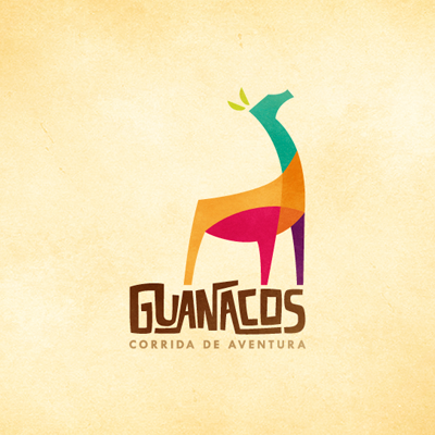
1. The Logo of the Month, July 2012 - Guanacos Logo by henriquepl
Here's the winning logo design of the month, impressive by the unity of shapes and styles between the icon and the typeface and by the variety of bright, well chosen colors. We really loved the proud Guanaco icon and the way the light and shading were played with different colors, telling us something about the diversity and multi-faceted business it represents. The alternation between soft curves, hard edges and pointy corners also speak out about the adventures this company offers. Great custom typeface is worked into the logo design, along the styles of the icon to give a solid ground for it. It looks like the rocky off road the Guanaco dwells in, that enforces the promise of a great adventure. Above all, the logo is an eye candy and so well executed. Congrats henriquepl for a great logo design and for a well deserved Logo of the month win!
