Logo of the month: June 2012
It's time for the Logo of the Month again, when we select ten of the best logo designs posted on The Logo Mix gallery within the last 30 days or so. We've witnessed again a tough competition and we present you with the beautiful and inspirational design work of the winners. Check out this month's selection and get ready to be impressed by great design ideas and amazing execution. Enjoy! ...and, hey, don't forget to leave a word of congrats for the worthy designers.
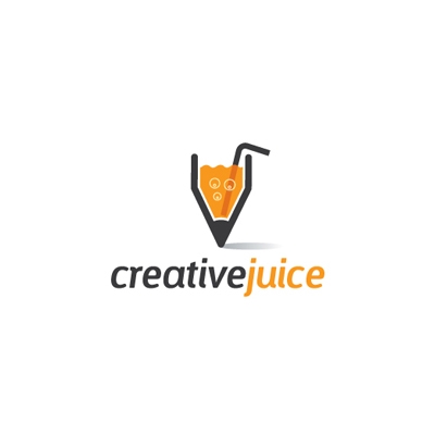
10. Creative juice Logo by sknny
Personal branding for a creative designer with a cool interpretation of the slang phrase "creative juice". It is a literal approach in the design, that works well here. Just imagine how fun it would be to have a pen shaped glass from which you can sip creativity once in a while, just to spice things up in your head, especially when dealing with a creative block. A great idea that was nicely put into graphics.
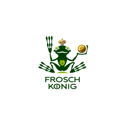
9. Frosch Konig Logo by Type and Signs
TaS brings us another one of his "stories in a logo", that we grew so fond of over the time. With carefully selected elements and just enough details to make it readable and fun, Frosch Konig logo reminds us of the happy times of the childhood when anything was possible. We simply love the illustration and the colors, and the typeface style is in perfect sync with the design.
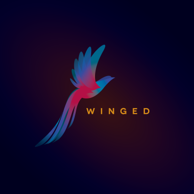
8. Winged Logo by AsaM.
Grace, dynamics and energy transpire from this logo design, inducing hope and the desire to achieve goals. The fantasy bird is so well designed, the wings, the tail and the ascending body are well balanced, and the colors are perfectly blended into each other. The transparencies and the gradients are so well played, that they create a beautiful and visually appealing logo. The chosen typeface is simple, in a complementary color and has the only purpose to support and lift the symbol.
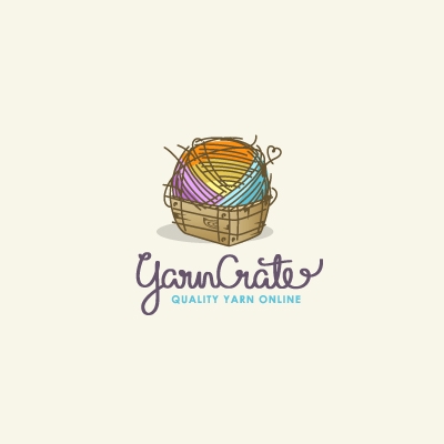
7. Yarn Crate Logo by ancitis
The first thing to notice is the care with which this careless-looking illustration was worked with. The details are perfect: the small thread heart, the shabby wooden box, the amazing colors and the perfectly suited handcrafted typeface. All this elements create a great visual for this logo and give a chick feel to it.
6. The Horn King Logo by Type and Signs
A very artistic approach that TaS surprised us with here, to create a bold and very dynamic logo design. You definitely need a second and a third look at this logo to really grasp the complexity of lines. The blow horns crown is the main character here, taking up most of the space and creating impact, while the king itself falls on the second place, being merely sketched. A truly impressive work.

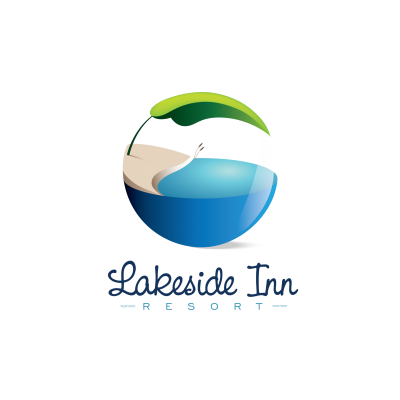
5. Lakeside Inn Logo by chrisworks
We're not declared fans of the 3D style logo designs, but this one won us over. I'd call it "tranquility in a crystal ball", a world of ideal wellbeing. The color gradients, the play of lights and shadows are so well designed that it creates a credible 3D effect, with only 2D methods. Simple and well chosen elements transmit a state of calm and relaxation. With an addition of a handwritten typeface the logo is convincing and visually appealing.
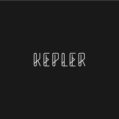
4. Kepler Logo by Nick Hood
Whenever the occasion presents itself, we love to have a beautifully crafted typeface on our monthly selection. This time we have a pure beauty that impressed us through its architectural structure, its modern look and great impact. It is probably one of the best wired logos I've seen in a long time, and the consistency with which the design idea was carried from letter to letter is simply amazing.
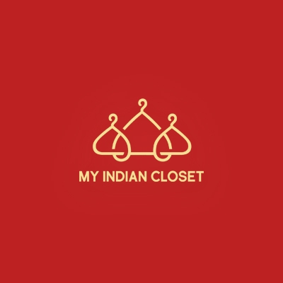
3. My Indian Closet Logo by ancitis
Simple, well crafted ideas create the most impact and last longer. Fashion meets India in this logo with a great marriage between two very well known symbols: a clothing hanger and the Taj Mahal. The idea was beautifully implemented, and the outcome is simple, visually appealing and tells the right story. Admiring the logo, it's one of those times you wish you'd come up with this logo design yourself.
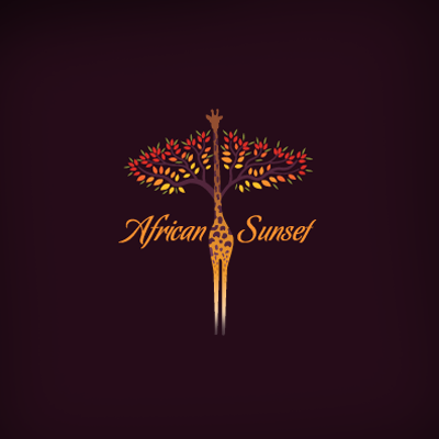
2. African Sunset Logo by Melanie D
A gorgeous logo design infused with the elements and the feel of the region it depicts. The colors are astonishing, they are so vibrant and alive, as if taken from an African scenery. The design is so well played, perfectly combining specific elements: an african tree, the stylized giraffe, all filtered by the beautiful light of the African sunset. Also, to note the very nice choice of typography and the excellent placement of it.
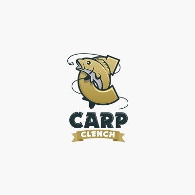
1. The logo of the month, June 2012: Carp Clench Logo by ancitis
Am excellent design work, achieved with great attention to every little detail. The designer hasn't missed anything here. The illustration is carefully drawn, the elements are well balanced and the lighting effect is so well done. The logo has an antique feel to it, like made out of copper, which makes it bold and impacts the eye. Also, beautiful work on the type treatment that conveys it a unitary look.
It was a close race this time, especially among the top logos, but Carp Clench logo detached itself through its attention to little details, its dynamics and visual impact. Congrats, Ancitis, for a great work here! Keep it up!