Logo of the month: March 2012
With the spring just around the corner, it's been an inspired time for logo designers and a lot of beautiful logo design works has been posted to The Logo Mix gallery this month. You can imagine that this has made our task of selecting the top ten a lot harder… We don't complain though, but invite you, the awesome logo designers, to post even more outstanding logo designs in the future and make our task even harder. Check out these great logo designs that made it to the top ten logo designs in the month of March 2012 and leave a word of praise for the inspired designers.
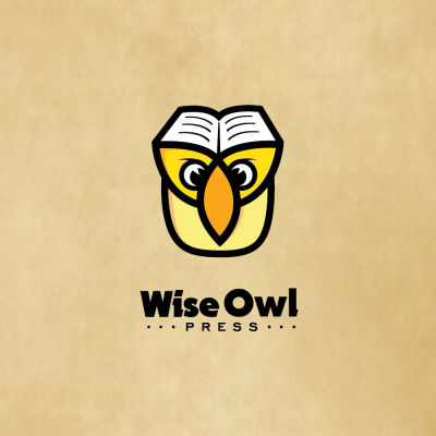
10. Wise Owl Logo by chrisworks
A bold and smartly achieved mark, the Wise Owl logo is remarkable even if it plays with regular elements, an owl and a book to represent wisdom, with the book also standing for the press side of the concept. The nice twist comes from the way the designer played with the elements, the bold lines and the versatility of the design that could work both in small and large print.
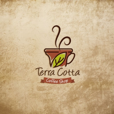
9.Terra Cotta Logo by Melanie D
A whimsical design with a countryside peaceful feeling, Terra Cotta Logo manages to bring forth a laid back atmosphere and the savor of fresh coffee. The earthy colors are such a great choice here sending back to nature and the simple, uncomplicated, handwritten typeface is the perfect fit.
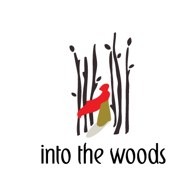
8. Into the woods Logo by NancyCarterDesign
Into the woods logo surprise through execution, the choice of elements and the fact that, even if the designer went for a literary approach, the logo makes sense without being too crowded. The logo design explores the story of the Little Red Riding Hood, with the woods being almost a hostile place (few lines are used to design the trees, the leaves are scarce and in the same color) and the character, a droplet of life, wearing the intense red shading hood. Beyond that, remains all the questions and the mystery of all the things to come. A great concept illustrated in just a few strokes by an inspired logo designer. Also, we have to mention the great choice of font and works so well with the lines of the wood, surrounding the character.
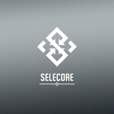
7. Selecore Logo by balic
Strong lines are used to mathematically build this powerful mark. Every element has its well established place and nothing is left randomly with this logo design. The logo stands out as a well planed game of perfect squares and bold arrows, with the negative space tuning along and building more of these elements. An architectural letter S stands out in the middle of the symbol, while the typeface and is built to match the concept.
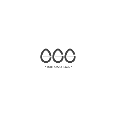
6. EGG Logo by artvento
It is our tradition to have a good typography logo in our top ten selection each month, and this time we have a cool, simple and very clever piece. EGG is such a smart concept, that it makes you stare at it and smile at it simplicity. It says it all just by looking at it… you don't need thoughts to understand the concept, or words to describe it… just eyes to enjoy it.
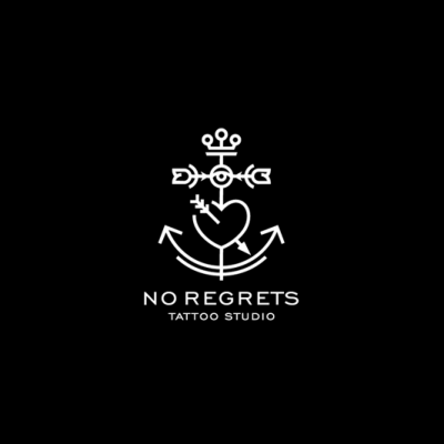
5. No Regrets Logo by Type and Signs
If I was a tattoo fan, I'd have this one imprinted on my arm. It just looks great and I can't say it better, but this one is such a tattoo material. Great elements, nicely designed. I know that the client preferred another version presented by the designer (you can view it here), but we just loved this one and included it in the top ten this month. Great concept, outstanding execution!
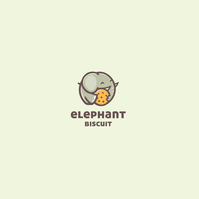
4. Elephant Biscuit Logo by cpuentes23
A gentle, playful logo, Elephant Biscuit is so well designed with a great care to little details that create the right expression and manages to transmit a warm and cosy feeling. The design elements are welded to each other so well, and the color scheme is great. Great choice of fonts complete this logo design to perfect fit.
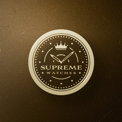
3. Supreme Watches Logo by ancitis
Designed with Swiss precision, Supreme Watches logo is carefully crafted and fine tuned to work perfectly. The design elements are chosen to address to the high end market, and are made with care for every detail. The logo design is well balanced, the word mark is well incorporated and typeface is chosen to work versatile in small type. Soft, golden color scheme was applied to suit the target audience.
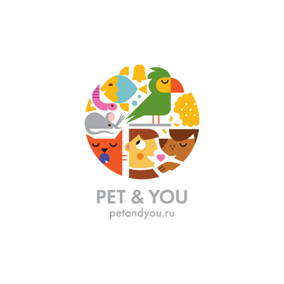
2. Pet & You Logo by ru_ferret
We're always amazed by the combination of diverse elements and great colors that ru_ferret brings to the table in his logo design work. This piece is no different. A multitude of design elements, carefully drawn in his own style, very bright and colorful, are welded together in a circle, that gives you the impression of looking through a looking glass into a pet house, creates this well put together logo design. The logo is so happy and fun, a mere eye candy.
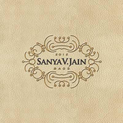
1. Logo of the month March 2012: Sanya V. Jain Logo by Type and Signs
A carefully designed logo, with mastery lines and intricate patterns and a client who vanished. The story of, oh, so many designs and designers that meet up, online or offline, with the wrong clients. In this case, let some justice be done. We can't offer a payment, but we can offer recognition for an amazingly well crafted logo design. Congrats, TaS, for an outstanding work and may your logo find the right home.