Logo of the month: November 2011
We're posting the Logo of the month for November 2011 a bit late, but as you probably know yourself, December is probably one of the busiest months of the year for any graphic or website designer. Nevertheless, as designers took their time to post awesomeness we were happy to take the time to review and somehow make a top. If awesomeness can be rated and put into a top, that is. We're happy to make another great selection of great logo designs posted on the Logo Mix gallery in the month of November 2011. Check them out and leave your praise!
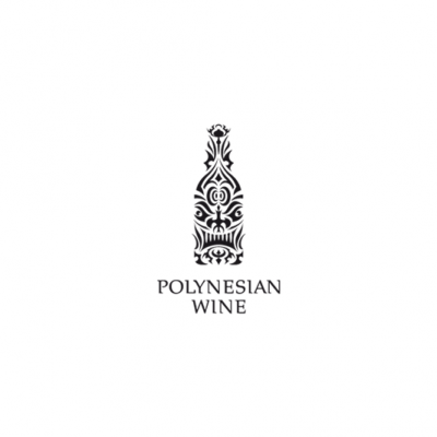
10. Polynesian Wine Logo by Type and Signs
Part of a fun "competition" among world class designers, the polynesian wine logo is full of character and reflects the designer's awesome skill set in identifying the right elements and creating a superb piece of design. The logo is beautifully developed and has a perfect equilibrium of shapes and meaning. A remarkable logo design achievement born out of passion for design.
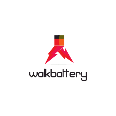
9.Walkbattery Logo by MDS
You've got to love this symbol as it is so clever and powerful. It is a brilliant graphic interpretation of the logo text using simple bolt symbols and a half battery graphic. The fun and novelty of the mark comes from the way it is built which is surprising and dynamic. Great typography choice, squared but fun, with a soft roundness.
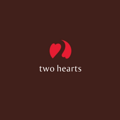
8. Two Hearts Logo by Zaicev Constantine
What a simple and smart way to design a love mark. Its about two hearts chasing each other in a game of logo design, embracing an empty space that cleverly build the number two. Great choice of typeface, elegant and somehow playful to complement and empower the symbol.
7. Occupy Logo by Logoturn
We just loved this mark, a great design achievement, a truly powerful design that stands out and burn the memory like a strong graffiti. Excellent choice of using the mark in black and white and perfect association with the tall, simple typeface that build on the meaning of the mark.
![]()
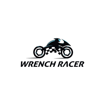
6. Wrench Racer Logo by MDS
Great transposition into design of a nice word play. Such a great execution, and a smart translation through graphics of speed and tech. Clean and dynamic shapes are bolted together into a truly powerful mark.
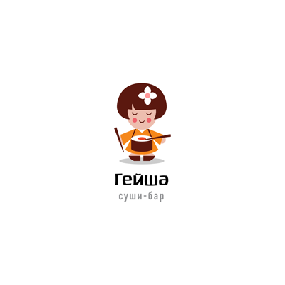
5. Geisha Logo by ru_ferret
A gorgeous piece of design jewel achieved with simplicity and a lot of character. Outstanding creativity, beautifully selected and drawn elements, precise proportions and a lot of fun manage to transpose the viewer into the world of the character. The typeface is so well selected that you don't even see the text, that go well with the verticality and balance of the design.
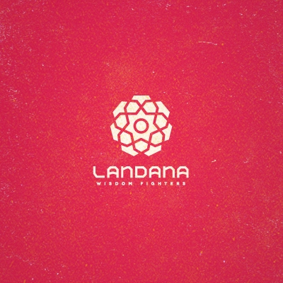
4. Landana Logo by YhankTou
Geometry, vectors, lines cut with mathematical precision, points of inflection… they all create a laser drawn logo, perfectly balanced with itself. Amazing association with a sharpe edged typeface build a robust logo design, carefully studied and executed. Every element occupy its destined place and the different levels just come together like Lego pieces.
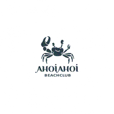
3. Ahoi Ahoi Logo by Type and Signs
We just love the crab symbol and the way it works so well with the typography. Knowing the designer, I'd assume that the typeface is custom or at least heavily modified to match the style of the icon (correct me if I'm mistaken, Bernd) giving that extra something to the design. Just enough details are used to confer class to the logo and the monochrome / tattoo like option makes the logo so powerful and outstanding.
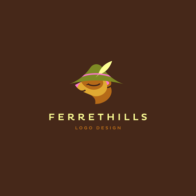
2. Ferrethills Logo by ru_ferret
The personal logo of an artist who's work we admire and appreciate here at the Logo Mix, designed it the true style of ru_ferret. Simple and carefully crafted lines that create superb illustrations, complimented by amazing colors are welded together to tell a story and to create a whimsical atmosphere. And because the characters and their virtual world needed a name, they were called Ferrethills. A magical character for a magical world.
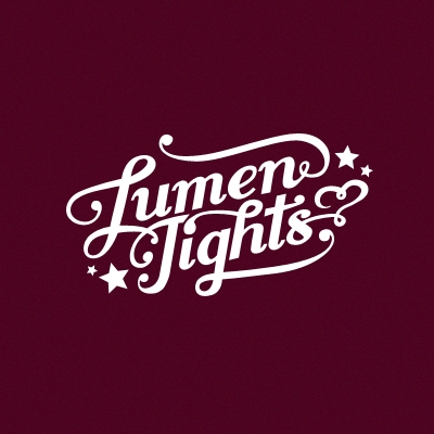
1. Logo of the month, November 2011: Lumen Tights Logo by ancitis
It is for the first time that we have a typography logo as a winner for the Logo of the month, here at the Logo Mix. An it is no wonder, if you take a look at this design! Follow the intricate and flowing lines, the perfect balance and the fine dynamics as they are brought together with refinement and elegance to create a true eye candy logo design. You can stare at it forever admiring every perfect detail and carefully drawn loop. Congrats, Ancitis, for an awesome design!