Logo of the month: October 2010
We initiate with this post our Logo of the Month selection which is to give credit and appreciate the value of the best logo designs posted on The Logo Mix gallery each month. We strive to appreciate through this selection the logo designers work based on our visitors votes, the comments posted and The Logo Mix team input. We had many very good logo designs posted this month and we thought it was difficult enough to short list five logo designs out of over 100 designs. Even so, the winner logo design detached itself pretty easily from the rest of the short listed ones and became our first Logo of the Month.
The fourth runner up: Coffee Night Logo by Andrea Zeman
A deep brown univers with a half moon rulling as a queen there in a cup of cofee. Superb execution, high level of details and deep rich color to complement a great logo design.
The third runner up: Mojito Logo by turbinski
A very clean design, but with such an inpact based mainly on a very well designed shape and great ballance. The proportions are perfect and the water element that is not there but you can see and feel it make this logo memorable.
The second runner up: Plexus Puzzles Logo by Breno Bitencourt
We appreciated the high level of detail, the fluidity of the design and the great combination of icon and typeface that make Plexus and wholesome logo design. We also appreciate the resistance in using an obvious puzzle jigsaw piece and the ability to design a feel rather that an object.
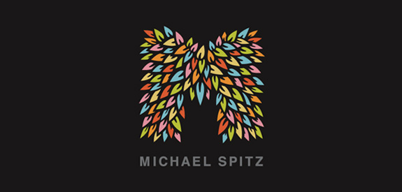
The first runner up: Michael Spitz Logo by michaelspitz
The personal logo of Michael Spitz almost made it to the top. It impresses through its genuine look and feel. The great selection of colors and the details of the icon in combination with a very simple typeface make a powerfull logo design. From his previous version, Michael Spitz kept adding details to its natual looking hedgy M that become probably the best letter based initial logo design posted on The Logo Mix gallery.
The Logo of the month: Lions Gate Mortgages Logo by UtahRugbyGuy
Lions Gate logo is the best rated logo design in October here at The Logo Mix and it is also our team's favourite logo design for this month. UtahRugbyGuy managed to come up with a fresh approach for a corporate logo, implying in the same time the stability and heritage that a morgage company needs in order to be successful. The logo design has a high impact through the right combination of colors and typeface and the stickingly high level of details. The vintage brass lion head door knocker is very well design and with much attention to fine details. The well chosen font complements the icon and gives the logo stability as a whole. Great job over all!
