
Melbourne, the brand, has been given a $240,000 facelift and the result is a big M.
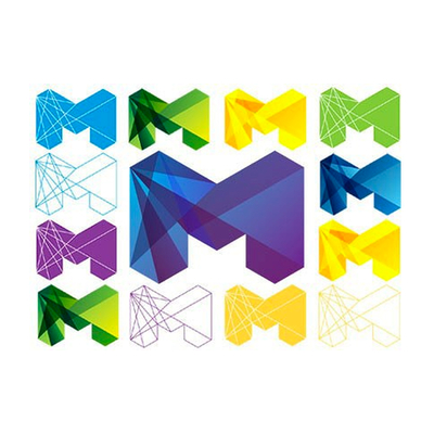 Lord Mayor Robert Doyle has unveiled a new logo for the city, which will replace the previous M and leaf symbol introduced in the early 1990s.
Cr Doyle said the old logo was "a bit daggy" and Melbourne needed a new design to reflect its cool sophistication on the world stage.
"The world's changed, the city of Melbourne has changed, this organisation has changed as well, and we're now playing far more, not just on the national stage but also on the international stage," Cr Doyle said.
Preliminary research for the new brand cost the council $91,000 and the design itself cost $148,000, Cr Doyle said.
But he defended the cost, saying the new logo would save the council money in the long run by gradually replacing about 50 different logos the city now uses for its various services.
Designing those logos cost about $90,000 a year, excluding brand maintenance costs.
Monash University marketing expert Francis Farrelly described the new logo as ``OK''.
"It certainly doesn't jump out at me immediately, it reminds me a little bit of some of the early incarnations of the MTV logo with the big M,'' he said.
Read more: theage