Logo of the month: October 2011
We've had some cool logos posted here on The Logo Mix logo design gallery in the month of October 2011, out of which we've selected a handsome top ten. It was a close race and the winner detached itself based solely on a great idea. Check out the monthly top ten best logo designs and leave a congrats message for the winners.
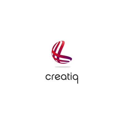
10. Creatiq Logo by almosh82
A classic solution designed in the best way possible. With this logo we appreciated the care and the high quality of the execution, its professionalism and its cleanness. Great use of color and perfect choice of rounded font that works perfectly with the symbol.
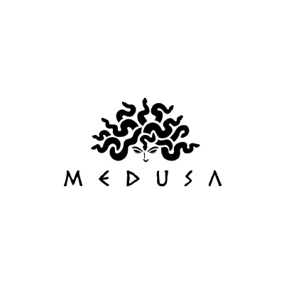
9. Medusa Logo by hellyeahdesign
A nicely designed logo that reminds me of the Black Perl from The Pirates of the Caribbean. Excellent snaky haircut to create a whimsical face expression that is very suggestive and powerful. I'm not sure exactly why the greek typeface was used, but its pointy edges seem to work well with the design.
8. Fishking Logo by communication-agency
A simple, bold and expressive mark designed so it is easily used across different media. The fish icon is simple, with the crown icon, in a matching color, placed vertically so that is looks like its tail is on fire. A very versatile design accompanied by a great typeface to create a powerful and very well together logo design.
![]()
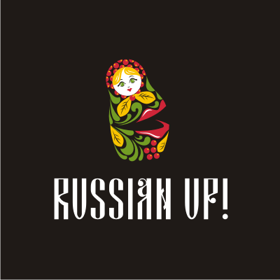
7. Russian Up Logo by alenadvertising
I must admit I loved this design the first time I've seen it. It scream Russian out loud. The matryoshka doll is a great Russian national symbol and it is used so expressively here and modified so it speak up! You must notice the great use of the Russian design motives complemented by a great choice of a typeface. A very nice design achievement!
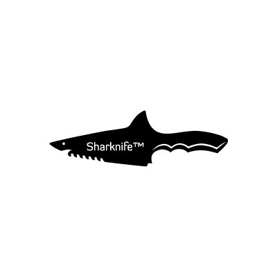
6. Sharknife Logo by vasvari
Two words connected with a "k", a simple idea and a great illustration. A hunting knife and a hunting mammal, a killer knife and the killer if the seas… a very nice association of concepts and a great design achievement. A modern typeface placed as a signature is a very suitable solution for a really cool logo design.
5. Jakubec Logo by communication-agency
If you know anything about hunting, you know that bragging and hanging their trophies on the wall are a huge part of the deal. The illustration on this logo looks like a perfect hunting trophy, with a suitable badge and nice little decorations on it. The illustration is simple, but very nicely achieved with just enough details to create a feel to it. Simple, squared typeface in combination with a handwritten on complement very well the idea.
![]()
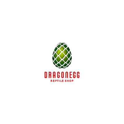
4. DragonEgg Logo by Type and Signs
Even if I'm not mad about the typeface, I must admit that the dragon egg illustration is perfect. The lighting / shading work is amazing and the thickness and the depth of the egg surface is a true work of art. If you've watched Game of Thrones and seen the dragon eggs there, you'll know what I'm talking about. Great illustration again, L&B!
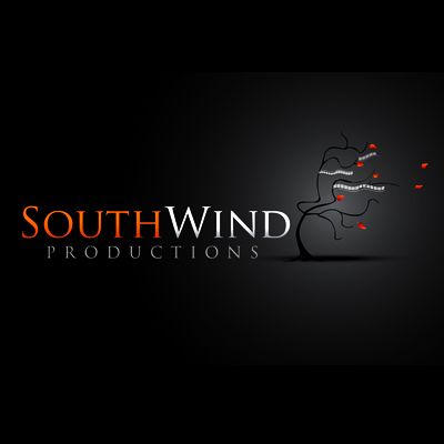
3. South Wind Productions Logo by logospecialist
An elegant design solution for a film production house with a very realistic achievement of a film tree bent by a the south wind. The tree illustration is very nice with cool waving film hanging from the branches and very nice color accents achieved using the orange leaves. All in all a very nice and suggestive image.
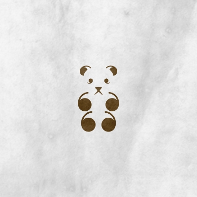
2. Bear Quotes Logo by aHizab
It seems to be the month of the great logos born out of simple design solutions. In short, take some commas and play with them until you get a really nice bear character, just perfect for an iconic logo design. There's no text to complement the obvious in the logo design just simple commas and a small nose. Perfect simplicity.
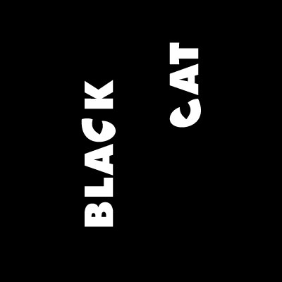
1. Logo of the month October 2011: Black Cat Logo by vasvari
It's simply hypnotic. You look at it and all you can see are those catchy eyes that stare at you from the dark. Exactly what you'd expect from a black cat in the night. The magic is achieved using a rare solution for a logo design, that is a simple white text rotated 90 degrees, with an outstanding integration of font and graphics. The simple readability of the logo is sacrificed for the greater effect of the staring feline eyes, which is the main point of this logo in the end. Simple thick white text is used to keep the focus and emphasize the design idea. A great logo that really deserves to be the logo of the month. Congrats, Peter!